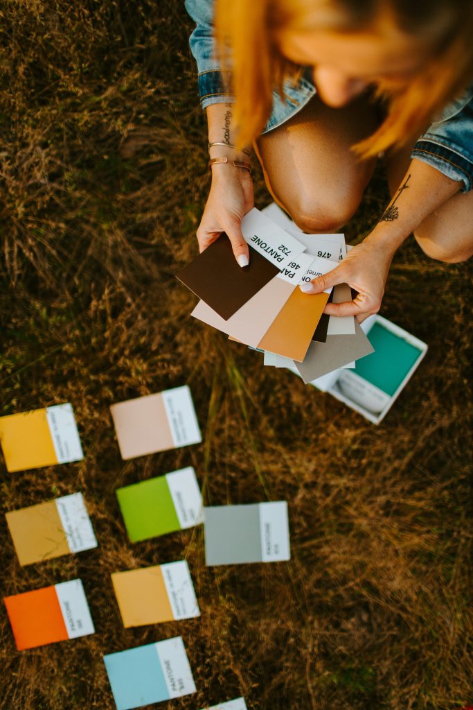
Color theory in web design is an essential element that influences the visual appeal, usability, and overall effectiveness of a website. By understanding how different colors interact and affect human perception, web designers can create engaging, intuitive, and aesthetically pleasing websites. From the basic principles of the color wheel to the psychology behind color choices, mastering color theory is crucial for creating the right color scheme for any web design project. Here’s why color theory is so important in web design.
Understanding the Basics of Color Theory
Color theory is the study of how colors interact and the visual effects of color combinations. At its core is the color wheel, a visual representation of primary colors (red, blue, yellow), secondary colors (green, orange, purple), and tertiary colors, which are combinations of primary and secondary colors. Web designers use the color wheel to create harmonious color palettes by exploring complementary colors (colors opposite each other on the wheel), analogous colors (colors next to each other), and monochromatic colors (different shades of a single color). Understanding these relationships helps designers select color schemes that enhance the visual appeal and functionality of a website.
The Role of Color Psychology in Web Design
Color psychology plays a significant role in web design by influencing how users feel and behave on a website. Different colors can evoke specific emotions and reactions; for instance, warm colors like red and orange often convey energy and urgency, while cool colors like blue and green are associated with calmness and trust. By selecting the right color palette, web designers can create the desired emotional response from users, whether it’s encouraging them to make a purchase, sign up for a newsletter, or simply enjoy browsing the site.
Creating Visual Hierarchy with Color
Visual hierarchy is a key principle in web design that guides users’ attention to the most important elements on a page. Color contrast is a powerful tool for establishing visual hierarchy, allowing designers to make specific elements like buttons or headlines stand out. For example, using a contrasting color for a call-to-action button can draw the eye and encourage clicks. Web designers also utilize color harmony to create balance and cohesion across the site, ensuring that no single element is too overpowering. By carefully selecting background colors, accent colors, and neutral colors, designers can lead users through the content in a natural, intuitive flow.
Accessibility and Color Choices
Accessibility is a critical consideration in web design, and color choices play a significant role in making websites inclusive for all users, including those with color blindness or other visual impairments. Ensuring sufficient color contrast between text and background is essential for readability, while avoiding problematic color combinations can help make the site more accessible. Web designers must also consider color meaning and cultural differences, as the same color can have different connotations in various cultures. By prioritizing accessibility, designers not only improve the user experience for a wider audience but also adhere to web accessibility standards, making their designs more effective and user-friendly.
Keeping Up with Color Trends
Color trends in web design are constantly evolving, influenced by shifts in technology, fashion, and cultural dynamics. Staying updated on the latest color trends can help web designers create modern and relevant designs that resonate with current audiences. However, while it’s important to be aware of trends, designers should always prioritize timeless principles of color theory, such as balance, harmony, and functionality. Whether opting for a trendy bold color palette or a classic neutral color scheme, the goal should always be to enhance the user experience and achieve the website’s objectives through thoughtful and strategic color choices.
In conclusion, color theory in web design is not just about aesthetics—it’s about creating a meaningful and effective user experience. By understanding the fundamentals of the color wheel, color psychology, and color relationships, web designers can craft websites that are visually appealing, accessible, and aligned with the brand’s identity and goals to help Google SEO with more conversions. The right color scheme can make all the difference in guiding user behavior, evoking the desired emotions, and ensuring the success of a website.


