In today’s world of design, understanding color psychology and its impact on your target audience is essential. Color psychology design plays a pivotal role in various fields, including graphic design, logo design, interior design, product design, and even UX design. Harnessing the power of color can make a significant difference in how your audience perceives your brand and engages with your content.
The Fundamentals of Color Psychology
Color psychology, also known as color theory, is the study of how different colors affect human emotions and behavior. By delving into color psychology, you can tap into the psychological effects that various colors evoke in your audience. This knowledge is invaluable in making the right color choices for your designs.
Color Preferences and Cultural Background
Color preferences can vary based on cultural backgrounds and individual experiences. For instance, while warm colors like red and orange are associated with energy and excitement in many Western cultures, they may evoke different emotions in other parts of the world. Understanding these nuances is crucial in global marketing and branding efforts.
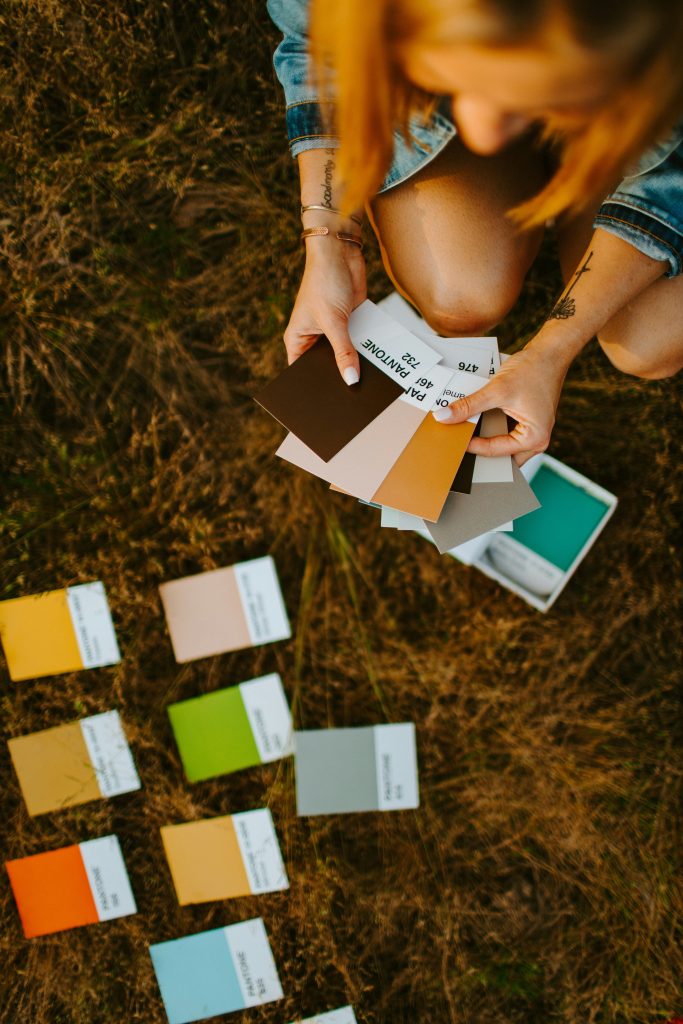
Creating a Color Palette
When it comes to color psychology design, creating a suitable color palette is key. A well-thought-out color palette includes primary colors, secondary colors, and tertiary colors. Primary colors form the foundation, and secondary colors are derived from mixing these primary colors. Tertiary colors are further combinations of primary and secondary colors. By incorporating these elements, you can establish a cohesive and visually appealing color scheme.
Complementary and Accent Colors
Understanding the color wheel and how complementary colors work together can help you create striking and balanced designs. Complementary colors sit opposite each other on the color wheel and, when used together, can create a dynamic visual impact. Accent colors, on the other hand, can be used to draw attention to specific elements, adding depth and personality to your designs.
Color in Branding
For brand identity, the selection of specific colors is critical. Each color carries its own meaning and associations. For example, blue often signifies trust and reliability, making it a popular choice in branding. Your brand color should align with your company’s values and message while considering the psychological effect it has on your audience.
Emotions and Color Perception
Different colors can evoke a range of emotions. Warm colors like red and yellow tend to create a sense of excitement and energy, while cool colors like blue and green often convey calm and serenity. Understanding the emotional impact of color can guide your design choices to elicit the desired response from your audience.
Design Tools for Color Psychology
Utilizing tools like Adobe Illustrator, you can experiment with color combinations and see how they affect the overall design. Adobe Illustrator provides a platform to experiment with different colors, helping you find the right color scheme for your project.
Integrating color psychology design into your website and ads is a powerful strategy that can positively influence your audience’s perception and engagement. Whether you’re a graphic designer, interior designer, or involved in any form of St. Louis web design, understanding color psychology is fundamental to making the right color choices and creating designs that leave a lasting impact. By considering the psychological effects of color, you can take your design work to the next level and build a stronger connection with your target audience along with search engine marketing St. Louis.